


Pivot Tables allow you to summarize, analyze, and present large datasets in a meaningful way, making it easier to spot trends, compare values, and create customized reports.
What is a Pivot Table?
A Pivot Table is a tool in Excel that enables you to quickly aggregate and analyze data from a large dataset. It allows you to transform rows of data into a compact summary that can highlight trends, comparisons, and patterns. Pivot Tables are particularly useful for financial analysis, reporting, and any scenario where you need to make sense of complex data.
How to Create a Pivot Table
Prepare Your Data: Ensure your data is organized in a table format with columns and a header row. For example, if you’re working with payroll data or a General Ledger, your table should have clear column headers like “Account Number,” “Description,” and “Amount.”
Insert a Pivot Table:
- Go to the Insert tab on the ribbon.
- Click PivotTable.
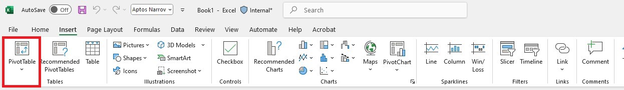
- Excel will automatically select your data range. Confirm the selection and choose where you want the Pivot Table to be placed (either in a new worksheet or an existing one).
- Click OK to create the Pivot Table.
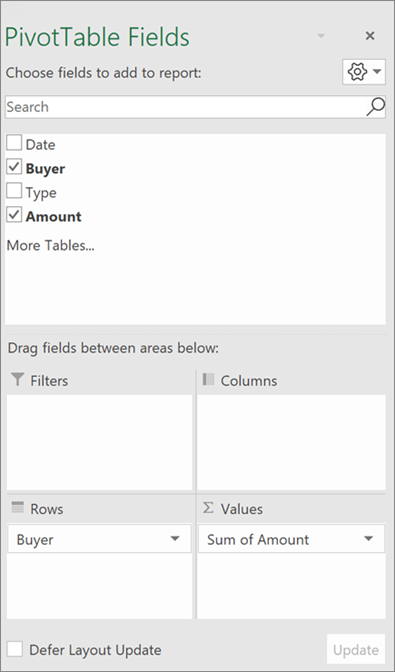
Configure Your Pivot Table:
- A Pivot Table Field List will appear on the right side of your screen. Here, you can drag and drop fields to organize your Pivot Table.
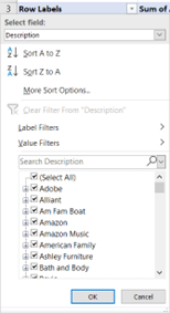
- Drag fields like “Description” to the Rows area to list unique descriptions.
- Drag “Amount” to the Values area to perform a sum or other calculations based on these descriptions.
Analyzing Data with Pivot Tables
Pivot Tables allow you to quickly summarize data, such as calculating total amounts for each description. By dragging fields into different areas of the Pivot Table, you can view your data from various perspectives:
- Rows: Displays categories or descriptions.
- Values: Shows aggregated data like sums or averages.
- Columns: Can further break down the data if needed.
- Filters: Allows you to filter the data displayed in the Pivot Table.
Using Slicers and Timelines
Slicers and Timelines are powerful tools that make filtering data in Pivot Tables more intuitive and interactive.
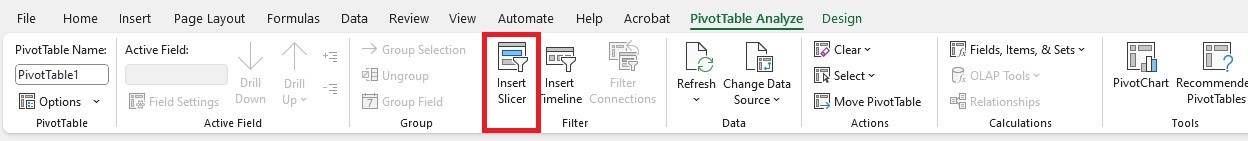
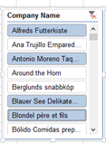
Insert Slicers:
- Go to the Analyze tab under PivotTable Tools.
- Click Insert Slicer.
- Choose the fields you want to filter by, such as “Description” and “Category,” and click OK.
- Slicers will appear as separate windows that you can arrange and resize. They provide a visual way to filter your data quickly.
Using Slicers:
- Click on a value within a slicer to filter your Pivot Table. For example, if you select “AP” in a Category slicer, the Pivot Table will update to show only data related to “AP.”
- Use the clear filter button in the top right of the slicer to remove the filter and display all data again.
Tips for Effective Use of Pivot Tables
- Organize Your Data: Ensure that your data is clean and well-organized before creating a Pivot Table. This will help in getting accurate and meaningful results.
- Use Multiple Fields: Experiment with dragging multiple fields into different areas of the Pivot Table to explore different aspects of your data.
- Refresh Your Data: If your underlying data changes, remember to refresh your Pivot Table by right-clicking anywhere in the Pivot Table and selecting Refresh.
By understanding how to create and use Pivot Tables effectively, along with leveraging slicers and timelines for filtering, you can gain valuable insights and make data-driven decisions with ease.
Excel for CFOs & Business Leaders
Ready to run a data-driven business? Watch our free training to master financial tasks by taking advantage of advanced Excel techniques and new features.