


Dashboards in Excel provide a powerful solution for financial leaders, CFOs, and analysts to visualize and interpret data efficiently.
What is a Dashboard in Excel?
An Excel dashboard is a visual representation of key metrics and data insights presented in one central location. It combines various elements such as tables, charts, and Pivot Tables to provide a comprehensive view of your data. Dashboards help in tracking performance, monitoring trends, and making informed decisions based on real-time data.
Steps to Create an Excel Dashboard
Set Up Your Data
Before creating a dashboard, ensure your data is well-organized. This typically involves having a clear table with columns and headers, such as payroll information or financial metrics.
Create a Pivot Table
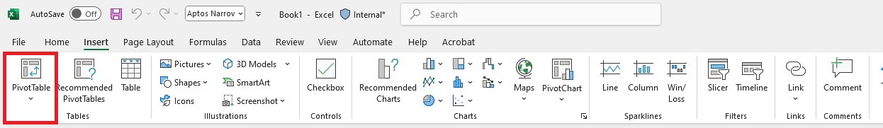
To analyze data effectively, start by creating a Pivot Table:
- Go to the Insert tab on the ribbon.
- Click PivotTable.
- Select your data range and choose where to place the Pivot Table (in a new worksheet or the current one).
Design Your Pivot Table
- Drag fields into the Rows and Values areas to organize and summarize your data.
- For instance, you might drag “Description” to Rows and “Amount” to Values to see a summary of different descriptions and their associated amounts.
Add Slicers
Slicers are interactive filters that allow you to easily segment your data:
- Go to the Analyze tab under PivotTable Tools.
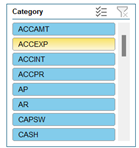
- Click Insert Slicer and choose the fields you want to filter by, such as “Description” or “Category.”
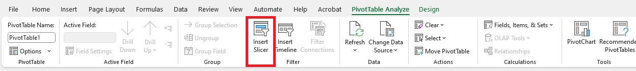
- Place the slicers on your dashboard. They allow you to quickly filter and view data according to different criteria.
Incorporate Pivot Charts
Pivot Charts visually represent the data from your Pivot Table:
- Select your Pivot Table.
- Go to the PivotTable Analyze tab and click PivotChart.
- Choose the type of chart that best represents your data, such as a column chart, pie chart, or line chart.
- Place the chart on your dashboard. It will update automatically based on the slicers and Pivot Table filters.
Link Data to Your Dashboard
If your data resides on a different worksheet, you can link it to your dashboard:
- Copy the range of cells from the source worksheet.
- Go to your dashboard, right-click, and choose Paste Special.
- Select Paste Link to create a dynamic link that updates automatically when the source data changes.
Customize and Format Your Dashboard
- Arrange your Pivot Table, slicers, and charts on the dashboard to ensure clarity and ease of use.
- Use Excel’s formatting tools to enhance the visual appeal of your dashboard. Adjust colors, fonts, and styles to make the data more accessible and engaging.
Enhancing Your Dashboard
- Templates: Utilize pre-designed dashboard templates to save time and get a polished look. Templates often include professional layouts and formatting options that can be customized to fit your data.
- Interactive Features: Incorporate interactive elements like buttons to navigate between different views or sheets. For example, a button can link to a detailed revenue analysis sheet.
- Data Visualization: Use sparklines, trendlines, and other data visualization tools to provide at-a-glance insights into trends and patterns.
By centralizing your data in an interactive dashboard, you can streamline analysis, make data-driven decisions, and improve your overall financial reporting. Excel’s flexibility allows you to customize your dashboard to meet your specific needs, making it a valuable tool for financial leaders and analysts.
Excel for CFOs & Business Leaders
Ready to run a data-driven business? Watch our free training to master financial tasks by taking advantage of advanced Excel techniques and new features.