


Utilizing charts and maps in Microsoft Excel can enhance data visualization and analysis, making complex information more accessible and actionable for users.
How to Use Charts and Maps in Excel
Create Charts
To create a professional-looking chart that displays the details that you want, you can modify the chart, apply predefined styles and layouts, and add eye-catching formatting. You can also reuse a favorite chart by saving it as a chart template.
To create a Chart:
- Select your data
- Go to the Insert Tab and choose one of the Chart Types in the Chart Group.
- Once your chart has been created you now can use the contextual tools for formatting the chart.
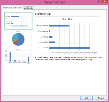
Recommended Charts
With Chart recommendations, Excel recommends the most suitable charts for your data. Get a quick peek to see how your data looks in the different charts, and then simply pick the one that shows the insights you want to present.
The Recommended Charts button on the Insert tab lets you pick from a variety of charts that are right for your data. Related types of charts like scatter and bubble charts are under one umbrella. When you click a chart, you’ll also see a simpler Chart Tools ribbon. With just a Design and Format tab, it should be easier to find what you need.
Modify and Format Charts
Add Chart Elements
Three chart buttons let you quickly pick and preview changes to chart elements (like titles or labels), the look and style of your chart, or to the data that is shown.
Layout Options
On the Layout tab for Chart options, you will find ways to add or remove different elements of a Chart like:
- Titles – Chart and Axis
- Legends
- Data Labels
- Data Tables
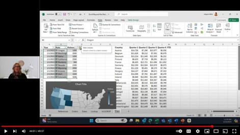
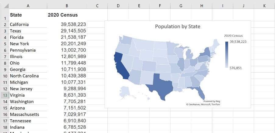
Create a Map
Using maps in Microsoft Excel allows you to visualize geographical data in a clear and impactful way.
Create a map:
Prepare Your Data: Ensure your data includes geographical information such as country, state, county, or postal codes.
Select Your Data: Highlight the range of cells that contain your geographical data.
Insert a Map Chart:
- Go to the Insert tab.
- Click on the Maps option in the Charts group.
- Select Filled Map.
- Customize the Map:
Once the map is created, use the Chart Tools to modify it. You can add or remove elements like titles and labels, change colors, and apply different styles.
Adjust Data Series:
Click on the map to bring up the Chart Elements button and the Chart Filters button to refine what data is displayed and how.
Analyze and Interpret:
Use the map to draw insights by visually comparing geographical regions.
This process helps you transform raw data into a visual representation, making it easier to identify patterns and trends based on location.
Watch the full training
Watch the full training to learn advanced Excel techniques and best practices. You’ll get a quick overview of Excel’s advanced features and common business use cases. No matter what your experience with Excel is, you’ll leave this training with something new.